Construction of Music Video
Final Music Video
Final Digipak


Music video Construction: production
First Day of Filming actress one (Ruby and Abi)-
Behind The Scenes:
Ruby- These images show the behind the scenes process, and the second image showing a break from filming for an attempt to warm up to avoid any health hazards such as a risk of hypothermia especially as the outfit I was wearing exposed a lot of flesh.
.JPG)
Location:
This is the location Abi and I have chosen to film at today. It is close to my house in Weybridge, meaning we could transport equipment easily and also, as it was an extremely cold day, we could go back home to warm up if necessary. We shot most of the lip syncing shots, as well as some photographs for the digipak. We also shot some footage in my room too. This was all done efficiently as we went straight from college as we both have the same timetables, and because we agreed to make myself the actor within the video too, it made this day of filming a lot less hassle free.
.JPG)
.JPG)
Behind The Scenes (Initial 'domestic violence' Makeup):
This is an example of what my makeup looked like for the result of domestic violence. We used
fake blood to create cuts and shades of purple, green and brown eyes-shadows to create bruises, as well as smudged mascara to portray the despair and the fact the character has been crying to make it look more realistic. I did my own makeup on myself as this was my allocated role, I also did completely different makeup for the scenes in the forest that represented the fairy-tale we are imposing.
.JPG)
Second Day of Filming actress one (Ruby, Abi, Nadia, Katie)-
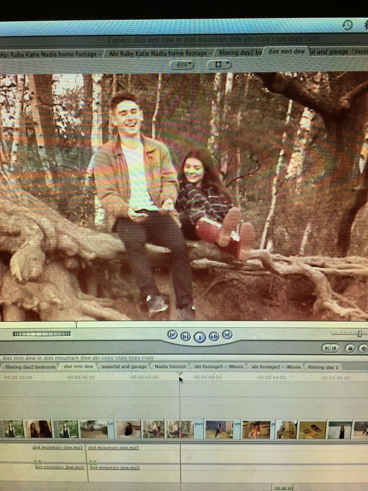
Our second day of filming consisted of us going to Virginia Waters to film certain parts of the music video and take pictures for our ancillary products. We chose this location as we thought it would fit our 'indie' genre well as well as having a variety of different places within (e.g- a waterfall, a lake and woodland area) so that our final products could show versatility. We also made sure to plan ahead, as we arranged with our media teacher to speak to our tutors to let us not attain form time so we could have a chance to film all together as a group (as this is quite difficult due to our different college timetables and other commitments such as work). We also needed to film at this specific time (11 am-3.45 pm) because otherwise the dark lighting later in the day is not suitable for us to film and take photographs.

.JPG)
.JPG)


Third Day of Filming (Ruby, Abi, Nadia, Katie)-
Our third filming day took place Abis house. Since our last filming day we have decided to change the model for our music video as we did not feel that the footage that we had done reflected our chosen genre (indie/rock).Therefore Abi will now be in the video as we would still like a group member to be the main protagonist as this makes filming and photographing much easier and means that the actor is more reliable and available.
The filming we have done today is of the negative part of the music video. We see the protagonist getting out of bed. She is covered in bruises and the mise en scene suggests she has been drinking. Once out of bed the actor rips up a photo of her and her boyfriend which suggests to the audience that it was the boyfriend that has caused the bruises. This scene highlights the main messages within the video , as it implicitly shows that the video tackles the issue of domestic violence.
Fourth Day of Filming (Abi, Nadia, Ruby and Katie)-
Our fourth day of filming took place at Virginia Water. We decided that we would redo parts of the footage we filmed on our first filming day as we had decided to change models. However this was beneficial to us as we had a better idea of what we were doing and how we could high quality footage. On this filming day we filmed the performance parts on the video where the model can be seen miming to the song. This enables us to start editing the chorus'. Whilst at Virginia water Katie took photos that we will be able to use for the webpage and digipak.

Our fourth day of filming took place at Virginia Water. We decided that we would redo parts of the footage we filmed on our first filming day as we had decided to change models. However this was beneficial to us as we had a better idea of what we were doing and how we could high quality footage. On this filming day we filmed the performance parts on the video where the model can be seen miming to the song. This enables us to start editing the chorus'. Whilst at Virginia water Katie took photos that we will be able to use for the webpage and digipak.
Fifth Day of Filming (Abi and Nadia) -
Yesterday (10/1/2014) Myself and Nadia went to complete the filming for our music video. We felt that more footage was needed to maintain the audiences interest of the narrative throughout the music video. For a part of the filming I (the actress) needed to have bruises, as we are targeting the issue of domestic violence. To make the bruises I used a mixture of different coloured eye shadows and applied them to parts of my neck and face to make it appear that I had been abused. I also had smudged mascara to show that I had been crying. I have created a video using an app on my phone called iMovie , the video displays me making the bruises and explaining why I have made these bruises.
Editing- post production
(Ruby and Abi)
As we have a deadline coming up (Friday 5th December) for all 3 product draft, myself and Ruby have decided to begin putting together all of the footage that we have recorded. We have 3 different bits of footage, some performance parts and two bedroom sections. Will be intertwining all 3 bits of footage throughout the music video , as from our research we found that are audience would be most inclined to watch a video that is part performance and part narrative.

Abi During my frees and lunchtime today (15/10/2014) I began to upload the latest footage that we had recorded. I began by uploading to iMovie , however I tried this a few times and each time I tried the programme would crash. After speaking to the college technician I was told that the Mac I was using had very limited storage left. In order to resolve this I began to delete some of the footage that we no longer needed , making sure I kept our final sequence , however in doing this our final sequence has been altered and is no longer working. Once I found this I began to recover all of our uploaded footage and have begun reconstructing our sequence with the new footage. Although this was very time consuming it will in fact make it a lot easier to insert the new footage as this will replace the footage in the original sequence.
Abi During todays lesson (18/12/2014) i am editing our group music video using Final Cut. I have been placing the footage in appropriate places and making sure i have cut the footage in more places to ensure the shots are shorter and beat with the rhythm of the music. From our draft feedback from our media teacher we found that some of our shots where too long and did not look fitting with the music.

Abi- In todays media lesson (5/1/2015) I have been editing our music video. I have found more footage which is enough to fill a chorus of the song , so this is what I have been doing. I have been using the razor tool to cut pieces of footage and match the miming within the clips with he lyrics of the song , which I find to be quite a time consuming job. However through my use of the programme final cut I am becoming more and more confident at editing and my skills within final cut have progressed massively therefore I have so far played the main part in editing our music video.
Despite this progress with the editing I have found that we do in fact need more footage to split up the performance , therefore this week we shall be filming more for the narrative section of the video.
Nadia - In todays lesson I have been getting to grips with how to use Final Cut. I have been carrying on from what Abi has previously done and cut sections of the footage in order to fill the chorus. As both Abi and I decided it was best to use a variety of shots ranging from close ups to medium shots to make the miming visible to the audience. This was quite time consuming as we had not organised the footage therefore had to keep exporting from iMovie. However I found that all the footage was all in similar locations therefore found it difficult to add extra original parts. Therefore Abi and I set a day where we were free to film extra narrative parts.
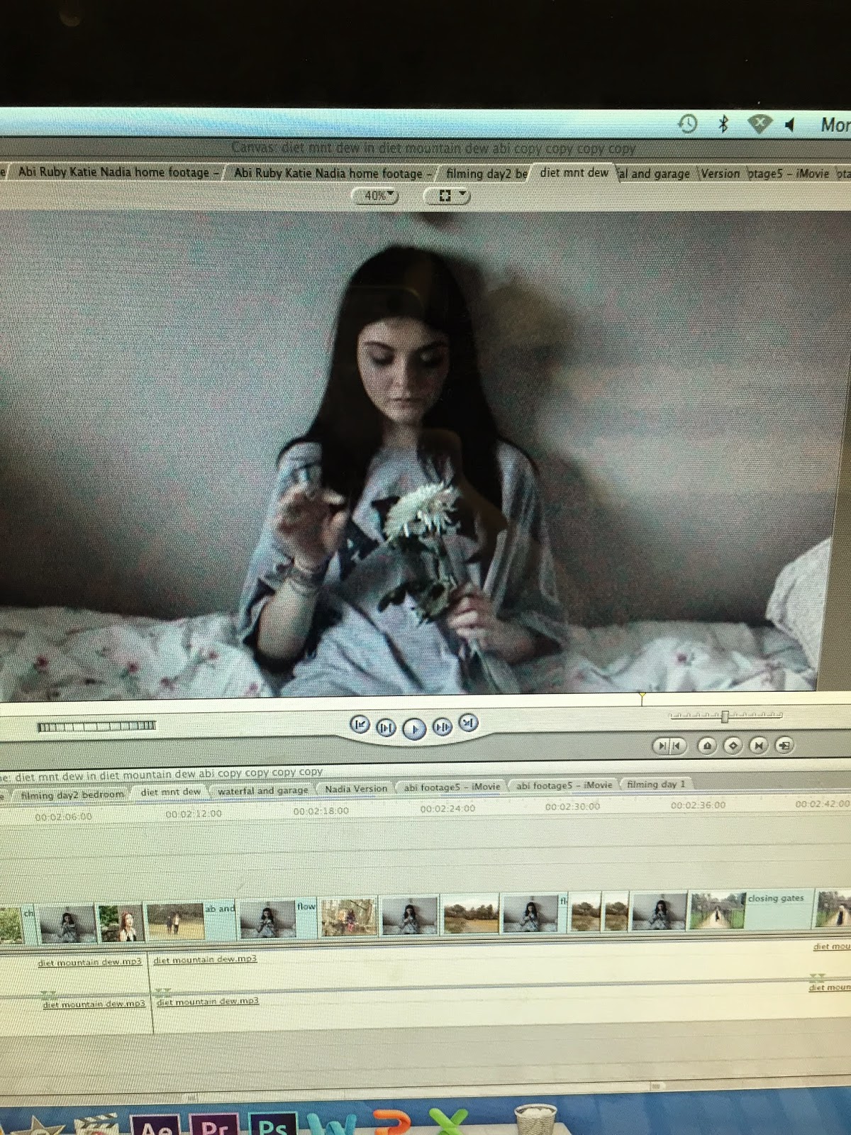
Abi-Today (12/1/2015) during my frees and after college until 6pm i have been editing the music video. I have managed to compete the ending sequence of the music video. I have created the sequence using the newest footage. IN part of the footage the actress (me) is sat in her bedroom picking petals of a flower. I feel that this reflect the childhood game 'He loves me , he loves me not' this reflects the main message within the video of domestic abuse. The actress is contemplating whether her partner still loves her despite the way he is acting (by abusing her). This clip of her picking the flower is cut in with clips of the actress and the actor (her boyfriend whom has been abusing her) this shows hoe she is feeling in the present , where she is deciding whether the pain of staying with him is worth the happiness that he brings her which is shown through the happy flashbacks of them together.
Nadia-
Abi- Today (13/1/2014) i have continued to complete editing the music video, I have now completed 1 min 42 of continuous footage that just needs filters added. The beginning of the video is almost complete now with only a 25 second gap. This will be completed by the end of the day ready for the deadline tomorrow.

I feel that the pinky colour that have chosen rouse as the filter represents love , and the love that was present between the couple. The pink could also reflect the saying 'rose tinted glasses' this means that the female actress has been looking back at her past through rose tinted glasses ; meaning that she is remembering the past better than it actually was. This maybe because of the contrast between the happy past and the painful present (abusive relationship.)

The colour reduce tool has allowed veto slightly reduce the colour , the effect has also made the clip appear to be more sharp and clear; achieving the effect that had intended.

Abi and Nadia- The editing of the music video is now finished so I will explain cinematography and editing choices throughout the video.
The video begins with a long shot of the couple walking toward the camera. On each beat there is a jump cut , this happens three times until the couple walk past the camera. By having a shot change on each beat it makes the images more fitting with the music , and the visuals of the video will flow better.
After the intro the song goes straight into chorus. The first chorus , and all of the chorus' incorporate performance sequences. The first chorus begins with a mid shot of the actress. This allows the shot to establish the outdoor location as well as enabling the audience to see the actresses facial expression , lip movements and clothing.

During The first chorus there Is a pattern of performance , narrative, performance , narrative. This allows the narrative to be clear throughout the video , whilst also allowing performance to be intertwined throughout.
After the first performance clip there is a clip of the actress getting out of bed. This is a long shot that shows the setting (the actresses bedroom)

This is the first shot where the narrative issue is revealed ; the large bruise on the actresses chest acts as an enigma code for what is really happening within her life.

This shot quickly followed by a shot of the couple together signifies that the boy is to blame for the bruises. This also shows the contrast between the scenes in the present (the scenes in the bedroom) and the scenes in the past ( the scenes of the couple together)

The scenes with the couple together I have edited with a filter. The filter is sepia with a pink tone to reflect the love that they share. The couple are seen in a wooded recreational area , as nature is deemed to be beautiful ad this reflects the beautiful love that they share.
There is a close up of a photograph of the couple together in the past. The close up shows the happy expression on the actors faces, to represent their happy past.

There is then a mid shot of the actress at a dressing table , she is holing the picture. She viciously rips the picture , we hear the picture rip over the audio to emphasize the sound. This represents her breaking free from the relationship.

There is then another close up of the picture ripped in half on the dressing table. This represents how the relationship is broken. The clip lasts a few seconds to show that the picture is not going to be repaired and representing that the relationship is not going to be repaired.

After this section of there is another chorus where the actress is singing in front of a lake. This creates a variety of shots and locations for the performance elements of the video.

During the chorus the camera shot changes to a mid close up of the actress. This allows the audience to see her facial expression and also see her singing the lyrics.

During the chorus the shot changes to a ,id close up of the actress on her bed . The mid close up allows the audience to see that she looks distress ; her mascara has run and bruises can be seen.This shows the audience how the relationship and abuse is overwhelming her.

The actress then goes to bathroom and examines her bruises in the mirror. This allows the audience to clearly see that she is begin gin to become concerned for her own safety.

After this we see an extreme close up of the bruise. This shows the audience the severity of the abuse that has been happening , this will make the audience feel sympathy for the actress and they will be able to empathise with her.


During the last sequence the music just plays the lyrics 'You're no good for me' repeatedly during this sequence there is a montage that swapped between the actress on her bed picking petals off a flower and happy memories with her boyfriend. The flower picking represents the childhood game 'he loves me he loves me not' this her deciding if her boyfriend still loves her despite the abuse.


Construction of Digipak:
Practice of editing photographs- Ruby
Today, to practice editing, I edited one of the photos we have selected as the final few we may use (however these are not definite yet and still need to narrow our choices down). I have chosen to use the online editing website 'Pic Monkey' as I used it for editing pictures for my AS coursework and found it to be rather successful. I have sharpened the image to create a more striking effect and define such assets of the model such as cheek bones and collar bones, as well as adding an effect to the picture too to create that 'eerie' fairy tale effect we are aiming to achieve. I believe it is useful to practice these skills so that it enables me to perfect my skills to ensure our ancillary products receive the highest marks possible. The before and after images are shown below.
Before

After

Ruby- It is the same for this photo too, however I have only used a subtle effect on it as I feel it is already a good photo and the effect brings out the colours of the trees nicely, enhancing the natural orange and yellow tones.
Before

After

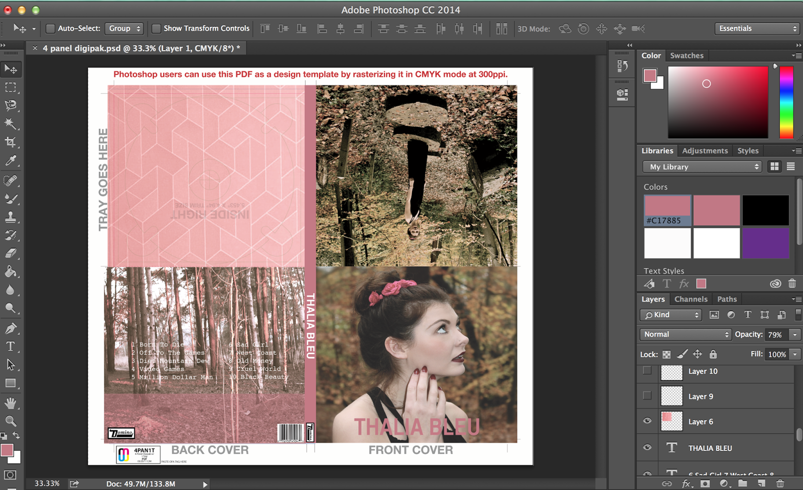
Ruby- I have begun construction of the digipak. I have decided to use a six panel
template with a tube pocket. We have decided to use this template as we plan to create an extra booklet of song lyrics and believe this extra pocket will be suitable for it to be inserted in to. We have downloaded the template to photoshop as it is a suitable software device for editing photographs and other media texts.

Digipak Draft- Ruby
I have begun to construct a mock digipak using some of the photos we took in Virginia Waters. This is helpful as we can identify what looks good and what doesn't work on our digipak. It also allows us to develop our skills on Photoshop to ensure we have the best results on our final digipak.


Editing Software on Photoshop- Ruby
By using the 'Liquify' tool on Photoshop I have been able to edit the females arm in the photo by reducing the size of it. This a useful tool to play around with as it can help us to manipulate a variety of images so they are of a professional standard.
Before

After

Ruby- I have begun to create the draft of the ancillary Digipak product and it shows my progress below. Since starting the construction of this we have changed the actor to represent our artist 'Thalia-Bleu', so some of the photographs will need to be changed in order to portray the brand identity when it comes to creating the final Digipak product. However creating the draft has allowed me to gain a clear idea of how we will construct the final product, so that it will be completed efficiently and to a high standard.

Font colour for front cover-Ruby
We need to make sure we pick the correct shade of one colour so that we can conform to the genres conventions as well as construct a clear brand identity. As this is only our draft so far, we can play around with different fonts and colours in order to pick the correct one for our final product.


Digipak photos - (Abi and Nadia)
22/11/14 Today we went to one of our chosen locations in order to film some of the music video , however we had some technical difficulties with the video camera so we were unable to film but we did manage to take pictures for our digipaks and webpage but due to the very wet weather they were not as successful as we had hoped.


Ruby- I have started to create our construction of our final Digipak. We have changed the actor as we believe she suits the indie genre more and, based on the feedback obtained from our draft Digipak, the original actor looked too gothic and wasn't able to construct a clear brand identity.

Ruby- Here is an example of how I have been getting to grips with photoshop and experimenting with the different effects and contrast of brightness. I have muted the original colour of the of the image as well as adding a filter to it. I have done this because from existing products I have researched into, many products from the indie genre of music incorporate this colour scheme into their products to enable them to look more unique, aesthetically pleasing and eye catching.

Ruby and Katie- In todays lesson me and Ruby have continued working on the digipak in order to get it finished for the deadline next Wednesday. We have added in more photos which were taken in Virginia Waters. However we are planning on filming and taking photos tomorrow so we will hopefully use the new photos that we take on the digipak to make it look more diverse. We also want some more photos of the landscape/setting that we are filming in as this is quite typical of the genre which we are using. We have now created our logo which is a dreamcatcher and we want this to be the main image on the front of our digipak to maintain brand identity throughout our products.
.png)
Digipak before feedback - Nadia:


Nadia- I have tried to make the Digipak as aesthetically pleasing as possible, so I have created an abstract tiled pattern using photoshop. It is a common feature on indie genre Digipaks to incorporate a design into it, this is so that you can maintain a brand identity and this is what I have done as I have also used this design on the background of the webpage to maintain consistency


Final construction of the digipak - Nadia


Digipak booklet construction
Abi- I have begun creating the booklet that will fit into the pocket in our digipaks. The booklet will contain lyrics to the songs on the CD. I begun by researching how I could make a booklet at home as I do not have Microsft Publisher. I found a website that showed me how to create a booklet on Microsoft Word.

I Once I had found out how to create a booklet , I then began to find the lyrics for the dongs that we where going to be putting on the album.To do this I researched on a search engine and found a site that supplied me with the lyrics for songs.I then copied them onto the Word document that I had created.

I then added images that we had taken during filming days , of the scenic locations that we had visited , and used these to create a background for the pages.

Logo construction
Abi- We have decided that we should construct a logo that we can use for our artist , we feel that this will help to maintain brand identity throughout our products. We initially thought of the idea of a dream catcher as this is an ornament often seen and owned by our target demographic. Dream catchers are also seen frequently within the indie genre. We then decided to use water colours to colour the image. We used water colours to fit in with the muted colour pallet that we have chosen to use.


Once the drawing was finished I scanned it in to my computer.

Once I had scanned it in I began to edit the drawing so that it could be seen more clearly. As I did not have Photoshop at home and my free trial had run out used paint and word.

I have begun to edit the final image of the dream catcher and merging it together on to a watercolour background. I have made 4 images that we could possibly use. I will ask people within our target audience to pick which image is their favourite , to enable us to see from their feedback which image our target audience would find most appealing.

Construction of webpage:
We have begun planning for our webpage. We have chosen 2 designs that we like and will be getting audience feedback on these so that we can then choose our final design. We have chosen to use a website called Wix.com.
Once we had received audience feedback on the two designs we found that our target audience favoured a design called 'single release'. We also feel that this template design is appropriate as it subverts many conventions of a generic music webpage and this reflects our artist; as she is a female in the Indie genre she will break conventions as Indie is very much a male dominated genre.
Ruby and Katie- We both created a mock website which we used as an initial idea for our actual website. The whole group discussed this and felt that it wasn't strong enough to be used so we then changed the layout and restarted a different website design.
Ruby and Katie- We both created a mock website which we used as an initial idea for our actual website. The whole group discussed this and felt that it wasn't strong enough to be used so we then changed the layout and restarted a different website design.

Abi- Once we had picked the template I have begun changing the text to our artists name 'Thalia Bleu' and I have changed the background picture to an image we have taken.

Abi- We as a group have decided that the template that we had chosen does not look like a realistic artists website. Although we do wan to subvert conventions we feel that the template did not exhibit a recognisable music website. Therefore we have chosen a new template that reflects some of the existing indie music webpages that we have examined.

Abi- I have changed the colour scheme to muted colours with a touch of very deep purple as this reflects out chosen genre whilst also giving it a feminine touch to reflect how we have subverted the indie genre by having a female artist , as the indie genre is male dominated. I have also added pages , and a gallery which we need to complete by taking more photos.

Abi- I have just inserted a main image to the webpage , we plan to re do this image as we would like an image that incorporates more scenery however we felt that the webpage looked too bare without an image at the top so for the time being we will use this image. I moved the text of our artists name to the centre so it looks as if the artist is looking at her name.I have also inserted a sound cloud of our chosen song 'Diet Mountain Dew'.

Abi- I have also added more images to make the webpage more visually appealing.

Abi- I have begun to edit the info page by changing the text and also changing the typeface to keep it consistent throughout the pages and also maintain a brand identity.

Abi- I have begun to fill the gallery page with images that we have taken , I will carry on to add images to the gallery as we do more filming and photo-shoots.

Ruby and Nadia- I have been creating a banner for the top of our webpage, which has been produced on photoshop and have made sure it has the correct dimensions in order to fit. In addition to this I have also changed the webpage template as as a group we believe the previous one was not suitable for our genre. To create the banner I have cropped an image of our actor by using photoshop and the 'magnetic lasso tool' in order to get a specific and complete crop.

Ruby- I have used the lasso tool and the eraser tool to carefully edit the background of the image of our model. It was a very intricate task as the models face had a lot of detailed features that I had to work around. For example, wispy bits of hair and eyelashes. However I overcame these difficulties and think that the outcome was very proffessional and represented real media products.


Abi -I have been editing our webpage today. I have begun by adding text to the 'about' page. This is a page that will provide the audience with information about Thalia Bleu. I have also added a banner image and our artists name to make the page visually pleasing.

Abi - I have begun editing the 'Live' page of the blog. I have added a part of our logo , the dream catcher to each page to help maintain brand identity throughout the ancillary products. I have also added a social media bar as I am aware of how important the proliferation of web 2.0 is among our target audience as they are very internet active and will appreciate the technological convergence that is provided on our webpage.

Abi- I have added a list of events that our artist will play at. I have picked 3 venues that I feel reflect our music genre the most. They are venues that are famous for holding new and upcoming indie artists. For each venue I have gathered some information and written about the venue and some of the artists that have performed there previously. I have added prices and addresses so the audience can book tickets with ease.

Abi- I have begun editing the gallery page. I have chosen a gallery that is in the format of a collage. I feel that this will give the page a laid back look that reflects the music of our artist and will therefore appeal to our target audience whom are aged between 15-25. The layout of the gallery very much reflects the layout of the social media site Tumblr. whose target audience is similar to our own ; this will therefore work in our favour as the audience will appreciate the collage layout.
I have uploaded images that we have taken on previous shoots. We will be shooting more photographs tomorrow (6/1/2013) to complete the digipak and webpage , I will also upload these photos to the gallery.

I have been editing our webpage , I have added the images that where taken yesterday to the gallery.

Abi - Today I found that it is only compulsory to have a home page of the webpage. Although the other pages do look good as this helps further brand identity as it is spread across a multitude of pages on the website. To ensure all of the work that has been done on the website is seen and appreciated I have been editing different sections on to the home page. I hope that this will allow the audience to view information easily as it will be accessible by scrolling down the homepage or alternatively clicking on one of the page tabs at the top of the page.
Abi and Nadia- I have added a 'social' section to the home page. I have added an Instagram feed and a twitter feed. This allows the audience instant access to Thalia Bleu's social media pages. I found through audience research that our target demographic gain a majority of artist information through social media , I also found that our target age group are most prevalent on the social networking sites Twitter and Instagram therefore these are the sites we have chosen to embed in our webpage. This technological convergence will allow us to spread Thalia Blue's brand identity across a multitude of different technological platforms ; Through existing product research we found this to be a very successful method for furthering an artists brand identity.

Ruby and Nadia- Today I have been working on the webpage and have completed it. The main progress I have made is changing the font on the subheadings to construct a fluent brand identity, and also rearranging the images and apps such as the Instagram and twitter social network feeds. I have created a tour dates banner, which has been developed from one I made earlier last year but did not use it. I have also created a 'Buy Tickets' button attached to it too, which links to the ticket master website to make the webpage more realistic to the audience.


Ruby- I converted the photoshop document to a jpeg and then further cropped the image using paint. The online website maker 'Wix' allowed me to insert an image that was saved on to my desktop and edit it to my desire. For example it enabled me to change the images size so that it could be in line or directly adjacent to another image or feature of the webpage.


I created the news feed using a list , which is a format that allows you to just add in text and images. I wanted the text to fit in with our brand identity and have the same typeface that is used across our products , however when using the list format i was unable to change the typeface therefore i have had to create a news feed without a format.

Abi-I have continued to edit the webpage through my frees. I felt that our homage looked quite bare so I looked at the band Haim's webpage for inspiration of what we could add. I saw that they had an image of their album cover and the date that it was being real eased. I felt that this was a good devise for advertising and spreading brand identity therefore i have decided to add our Digipak cover on to the webpage and I have added a release date and a 'preorder' button.

Abi- we have decided to alter the colour scheme on the digipak. Instead of a lilac colour being present throughout we have decided a pinky colour would be better , as there is are pink flowers in Thalia Bleu's hair.

Because of the change to the digipak we have decided to also alter the webpage background to maintain a strong brand identity throughout all of our products.

The pinky colour within the ancillary products will now also fit in better with the music video as during the video the actress is wearing a pink headband in the performance scenes. The video filters used on the flashbacks is also a pinky tone , therefore keeping the pink theme continuous.
No comments:
Post a Comment